🥮
🥮
🥮
Mooncake.
Mooncake.
Mooncake.
My Role: Product Designer
Timeline: 2 weeks
Tools: 3D Printer, Procreate, Blender, wood, bandsaw, dry erase board, glue
Skills Involved: User Interview, Product Design, Industrial Design
Overview: Mooncake was an assignment under Tufts' Industrial Design Essential course in which I was tasked with creating a toy, tool, or home good with one key feature and one "delighter" feature. For this assignment, I created a mooncake-inspired bookmark stand.
Challenge: The objective of this project was to elevate the tactile reading experience, encouraging people to read physical paperback and hardcover books over e-readers as they're easier on the eyes, promote better retention, and are less likely to distract someone.
My Role: Product Designer
Timeline: 2 weeks
Tools: 3D Printer, Procreate, Blender, wood, bandsaw, dry erase board
Skills Involved: User Interview, Product Design, Industrial Design
Overview: Mooncake was an assignment under Tufts’ Industrial Design Essential course in which I was tasked with creating a toy, tool, or home good with one key feature and one “delighter” feature. For this assignment, I created a mooncake-inspired bookmark stand.
Challenge: The objective of this project was to elevate the tactile reading experience, encouraging people to read physical paperback and hardcover books over e-readers as they’re easier on the eyes, promote better retention, and are less likely to distract someone.
My Role: Product Designer
Timeline: 2 weeks
Tools: 3D Printer, Procreate, Blender, wood, bandsaw, dry erase board
Skills Involved: User Interview, Product Design, Industrial Design
Overview: Mooncake was an assignment under Tufts’ Industrial Design Essential course in which I was tasked with creating a toy, tool, or home good with one key feature and one “delighter” feature. For this assignment, I created a mooncake-inspired bookmark stand.
Challenge: The objective of this project was to elevate the tactile reading experience, encouraging people to read physical paperback and hardcover books over e-readers as they’re easier on the eyes, promote better retention, and are less likely to distract someone.
My Approach:
Step 1: User Interview
To understand the experience of readers, I interviewed Ann Zhao, the Indie-bestselling author of Dear Wendy and a current worker in youth and teen services at a public library. I asked her questions over Zoom about her reading habits, what the tactile reading experience was like for her, her use of book accessories, emotions she associates with reading, and what her ideal reading experience looks like. From the interview, I gained three main takeaways:
For her, reading a physical book means that she's learning something new.
Instead of bookmarks, she often uses a physical scrap of paper, but she has to mark her books somehow because she doesn't remember where she left off.
She doesn't annotate her books because she feels like she's damaging them, but she doesn't use Post-Its either because she feels like they're too bulky.
Step 2: Competitor Research
I began to research competitor book accessories in order to find gaps in the market and current drawbacks of existing products. I discovered that while bookmarks were convenient for saving your place, they could be easily misplaced. Page-turners make one-handed reading simple, but make page-turning a hassle. Book lights are portable and reduce late-night eye strain but are unnecessary for daytime reading. Bookstands allow for hands-free reading but make it hard to turn pages rapidly. Annotation supplies foster memory and retention but slows down the reading process. And lastly, book rest lamps save your place while functioning as a light, but the light isn't very strong.
Step 3: Opportunity
I discovered a design opportunity through my user interview and research, finding that I could create an accessory that combines a bookmark, a place to note insights from the current read, and a physical bookstand, all inspired by the author's Chinese-American identity and current library job.
Step 4: Sketches
I then went into Procreate on my iPad and created sketches of my design concept, landing on a cube-shaped design with curved mooncake-like accents on the sides. A bookstand tray sticks out from one side with a protruding bookmark along with a dry-erase library card-like display at the front for writing down takeaways from the current read. On the back are two curved catchall trays for holding small items like jewelry, earbuds, or keys.
Step 5: Blender Model
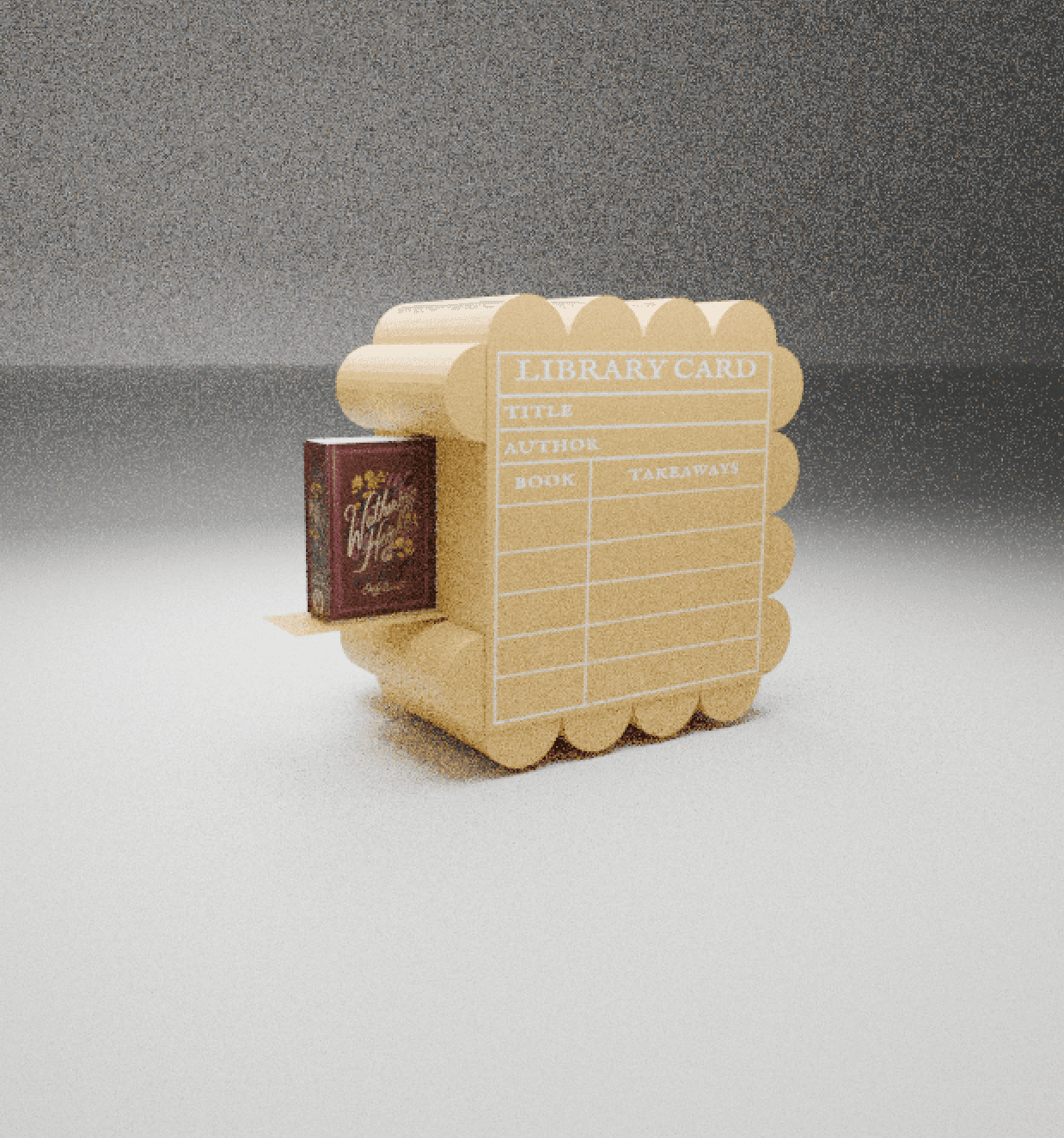
I went into Blender and created a high-fidelity render of the final design model, using a golden color to resemble a mooncake and adding a book on the tray to the side in order to convey my concept clearly.
Step 6: Build
To finish, I built a final prototype of my design using wood, glue, a bandsaw, and 3D printer. I used a dry erase board sticker to create the library card-inspired front and wrote out the display with Sharpie.
My Approach:
Step 1: User Interview
To understand the experience of readers, I interviewed Ann Zhao, the Indie-bestselling author of Dear Wendy and a current worker in youth and teen services at a public library. I asked her questions over Zoom about her reading habits, what the tactile reading experience was like for her, use of book accessories, emotions she associates with reading, and what her ideal reading experience looks like. From the interview, I gained three main takeaways:
For her, reading a physical book means that she’s learning something new.
Instead of bookmarks, she often uses a physical scrap of paper, but she has to mark her books somehow because she doesn’t remember where she left off.
She doesn’t annotate her books because she feels like she’s damaging them, but she doesn’t use Post-Its either because she feels like they’re too bulky.
Step 2: Competitor Research
I began to research competitor book accessories in order to find gaps in the market and current drawbacks of existing products. I discovered that while bookmarks were convenient for saving your place, they could be easily misplaced. Page-turners make one-handed reading simple, but make page-turning a hassle. Book lights are portable and reduce late-night eye strain but are unnecessary for daytime reading. Bookstands allow for hands-free reading but make it hard to turn pages rapidly. Annotation supplies fosters memory and retention but slows down the reading process. And lastly, book rest lamps save your place while functioning as a light, but the light isn’t very strong.
Step 3: Opportunity
I discovered a design opportunity through my user interview and research, finding that I could create an accessory that combines a bookmark, a place to note insights from the current read, and a physical bookstand, all inspired by the author’s Chinese-American identity and current library job.
Step 4: Sketches
I then went into Procreate on my iPad and created sketches of my design concept, landing on a cube-shaped design with curved mooncake-like accents on the sides. A bookstand tray sticks out from one side with a protruding bookmark along with a dry-erase library card-like display at the front for writing down takeaways from the current read. On the back are two curved catchall trays for holding small items like jewelry, earbuds, or keys.
Step 5: Blender Model
I went into Blender and created a high-fidelity render of the final design model, using a golden color to resemble a mooncake and adding a book on the tray to the side in order to convey my concept clearly.
Step 6: Build
To finish, I built a final prototype of my design using wood, a bandsaw, and 3D printer. I used a dry erase board sticker to create the library card-inspired front and wrote out the display with Sharpie.
My Approach:
Step 1: User Interview
To understand the experience of readers, I interviewed Ann Zhao, the Indie-bestselling author of Dear Wendy and a current worker in youth and teen services at a public library. I asked her questions over Zoom about her reading habits, what the tactile reading experience was like for her, use of book accessories, emotions she associates with reading, and what her ideal reading experience looks like. From the interview, I gained three main takeaways:
For her, reading a physical book means that she’s learning something new.
Instead of bookmarks, she often uses a physical scrap of paper, but she has to mark her books somehow because she doesn’t remember where she left off.
She doesn’t annotate her books because she feels like she’s damaging them, but she doesn’t use Post-Its either because she feels like they’re too bulky.
Step 2: Competitor Research
I began to research competitor book accessories in order to find gaps in the market and current drawbacks of existing products. I discovered that while bookmarks were convenient for saving your place, they could be easily misplaced. Page-turners make one-handed reading simple, but make page-turning a hassle. Book lights are portable and reduce late-night eye strain but are unnecessary for daytime reading. Bookstands allow for hands-free reading but make it hard to turn pages rapidly. Annotation supplies fosters memory and retention but slows down the reading process. And lastly, book rest lamps save your place while functioning as a light, but the light isn’t very strong.
Step 3: Opportunity
I discovered a design opportunity through my user interview and research, finding that I could create an accessory that combines a bookmark, a place to note insights from the current read, and a physical bookstand, all inspired by the author’s Chinese-American identity and current library job.
Step 4: Sketches
I then went into Procreate on my iPad and created sketches of my design concept, landing on a cube-shaped design with curved mooncake-like accents on the sides. A bookstand tray sticks out from one side with a protruding bookmark along with a dry-erase library card-like display at the front for writing down takeaways from the current read. On the back are two curved catchall trays for holding small items like jewelry, earbuds, or keys.
Step 5: Blender Model
I went into Blender and created a high-fidelity render of the final design model, using a golden color to resemble a mooncake and adding a book on the tray to the side in order to convey my concept clearly.
Step 6: Build
To finish, I built a final prototype of my design using wood, a bandsaw, and 3D printer. I used a dry erase board sticker to create the library card-inspired front and wrote out the display with Sharpie.



⋆.𐙚 ̊.
layla landrum