✨
✨
✨
Flickerbox.
Flickerbox.
Flickerbox.
My Role: Product Designer
Timeline: 4 months
Tools: Figma
Skills Involved: User Interview, Product Design, Mobile App Prototyping
Overview: Flickerbox was an assignment under Tufts' Human Factors Product Design course where I was asked to design the user interface for an app that would provide with visual stimuli at a frequency of 40Hz in order to improve cognitive functioning and alleviate the symptoms Alzheimer’s, as initial studies have shown. For this assignment, my group researched similar products, conducted user interviews, and I created a high-fidelity prototype of the app.
Challenge: The objective of this project was to design the user interface for an iPad app that delivers light flickering at a 40Hz stimulus to users in order to activate natural clean-up mechanisms in the brain and improve cognitive functioning, especially by alleviating Alzheimer's symptoms.
My Role: Product Designer
Timeline: 4 months
Tools: Figma
Skills Involved: User Interview, Product Design, Mobile App Prototyping
Overview: Flickerbox was an assignment under Tufts’ Human Factors Product Design course where I was asked to design the user interface for an app that would provide with visual stimuli at a frequency of 40Hz in order to improve cognitive functioning and alleviate the symptoms Alzheimer’s, as initial studies have shown. For this assignment, my group researched similar products, conducted user interviews, and I created a high-fidelity prototype of the app.
Challenge: The objective of this project was to design the user interface for an iPad app that delivers light flickering at a 40Hz stimulus to users in order to activate natural clean-up mechanisms in the brain and improve cognitive functioning, especially by alleviating Alzheimer’s symptoms.
My Role: Product Designer
Timeline: 4 months
Tools: Figma
Skills Involved: User Interview, Product Design, Mobile App Prototyping
Overview: Flickerbox was an assignment under Tufts’ Human Factors Product Design course where I was asked to design the user interface for an app that would provide with visual stimuli at a frequency of 40Hz in order to improve cognitive functioning and alleviate the symptoms Alzheimer’s, as initial studies have shown. For this assignment, my group researched similar products, conducted user interviews, and I created a high-fidelity prototype of the app.
Challenge: The objective of this project was to design the user interface for an iPad app that delivers light flickering at a 40Hz stimulus to users in order to activate natural clean-up mechanisms in the brain and improve cognitive functioning, especially by alleviating Alzheimer’s symptoms.
My Approach:
Step 1: Research
In order to design an app for users with Alzheimer’s, my group first needed to gain an understanding of this user group by conducting research on the condition. For our clinical research, we focused on the causes of Alzheimer’s, how it affects the daily lives of people with the condition, and how patients can improve their lives. This research gave us a concrete understanding of the condition along with a more holistic view of people affected by Alzheimer’s, allowing us to empathize with and understand the users the app would be developed for. We also researched the 40Hz mechanism, as the initial pitch for the project was based on research conducted by MIT. They conducted a study on mice with Alzheimer’s where the tau and beta amyloid proteins in the brain, which are believed to be associated with Alzheimer’s, were monitored as the mice were exposed to 40Hz stimulus for one hour a day. The results of the research demonstrated that a natural cleaning cycle in the brain was caused by the 40Hz flickering stimulus and led to less of these proteins being built up over time. This positive effect was compounded by using multiple forms of stimulus, including light, sound, and haptic; in the Flickerbox app we only focused on light.
Step 2: User Interview
In order to gain a better understanding of our elderly user group, we each conducted interviews with a family member, some of which had a family history of Alzheimer’s. Our questions were written to gain insight into what they disliked about using technology, their general attitudes towards Alzheimer’s, including if they were doing anything to prevent it, and whether they’d be willing to use an app as a preventative treatment or form of light therapy. Many of the insights we gathered from the user interview were implemented into the design for the app.
Step 3: Wireframing
Based on the user interview and research, I sketched some initial wireframes for the app.
Step 4: User Flow
I also created a user flow for Flickerbox focused on simplicity, ease of use, and accessibility.
Step 5: Color & Typography
Based on our goals and findings, I determined the color and typography that would be used in the Flickerbox app.
Step 6: Prototype
For prototyping the app, I used recommendations of designing apps for the elderly, including using fonts a minimum of 16px due to how common vision loss is in adults. The majority of fonts within the app were sans serif in order to improve readability, and while the headers were in serif font, they were made to be very large. Icons in the toolbar were labeled with text for clarity, the app doesn’t rely on gestures, and there’s a simple onboarding experience in order to introduce users to Flickerbox and alleviate potential skepticism early. In settings, users are also able to set up notifications and reminders to use the app, helping senior users integrate the app into their daily routine.
And based on the results of our interviews, we decided to recommend that the app be used passively, telling users to set up their iPad nearby and let the light flicker while they go about their daily tasks. Flickerbox uses purple and blue gradient backgrounds, which have a calming and relaxing effect on users, and are a high contrast to the white typeface.
The app was centered around three main pages: Flicker, Trends, and Profile. On the Flicker page, users are able to customize the color of the 40Hz light and setup a timer for how many minutes they’d like to view it. In Trends, users are able to track their weekly and monthly use of the app. In Profile, users are able to access the information about themselves entered during the onboarding experience, and edit it if they wish. In the Profile page, the app also recommends users how long to use the app per day and contains settings, where users can turn on and off notifications or a multi-attribution flicker. There’s also a help tab in Profile where users can view more information and research on 40Hz stimuli’s effects on the brain.
My Approach:
Step 1: Research
In order to design an app for users with Alzheimer’s, my group first needed to gain an understanding of this user group by conducting research on the condition. For our clinical research, we focused on the causes of Alzheimer’s, how it affects the daily lives of people with the condition, and how patients can improve their lives. This research gave us a concrete understanding of the condition along with a more holistic view of people affected by Alzheimer’s, allowing us to empathize with and understand the users the app would be developed for. We also researched the 40Hz mechanism, as the initial pitch for the project was based on research conducted by MIT. They conducted a study on mice with Alzheimer’s where the tau and beta amyloid proteins in the brain, which are believed to be associated with Alzheimer’s, were monitored as the mice were exposed to 40Hz stimulus for one hour a day. The results of the research demonstrated that a natural cleaning cycle in the brain was caused by the 40Hz flickering stimulus and led to less of these proteins being built up over time. This positive effect was compounded by using multiple forms of stimulus, including light, sound, and haptic; in the Flickerbox app we only focused on light.
Step 2: User Interview
In order to gain a better understanding of our elderly user group, we each conducted interviews with a family member, some of which had a family history of Alzheimer’s. Our questions were written to gain insight into what they disliked about using technology, their general attitudes towards Alzheimer’s, including if they were doing anything to prevent it, and whether they’d be willing to use an app as a preventative treatment or form of light therapy. Many of the insights we gathered from the user interview were implemented into the design for the app.
Step 3: Wireframing
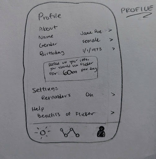
Based on the user interview and research, I sketched some initial wireframes for the app.
Step 4: User Flow
I also created a user flow for Flickerbox focused on simplicity, ease of use, and accessibility.
Step 5: Color & Typography
Based on our goals and findings, I determined the color and typography that would be used in the Flickerbox app.
Step 6: Prototype
For prototyping the app, I used recommendations of designing apps for the elderly, including using fonts a minimum of 16px due to how common vision loss is in adults. The majority of fonts within the app were sans serif in order to improve readability, and while the headers were in serif font, they were made to be very large. Icons in the toolbar were labeled with text for clarity, the app doesn’t rely on gestures, and there’s a simple onboarding experience in order to introduce users to Flickerbox and alleviate potential skepticism early. In settings, users are also able to set up notifications and reminders to use the app, helping senior users integrate the app into their daily routine.
And based on the results of our interviews, we decided to recommend that the app be used passively, telling users to set up their iPad nearby and let the light flicker while they go about their daily tasks. Flickerbox uses purple and blue gradient backgrounds, which have a calming and relaxing effect on users, and are a high contrast to the white typeface.
The app was centered around three main pages: Flicker, Trends, and Profile. On the Flicker page, users are able to customize the color of the 40Hz light and setup a timer for how many minutes they’d like to view it. In Trends, users are able to track their weekly and monthly use of the app. In Profile, users are able to access the information about themselves entered during the onboarding experience, and edit it if they wish. In the Profile page, the app also recommends users how long to use the app per day and contains settings, where users can turn on and off notifications or a multi-attribution flicker. There’s also a help tab in Profile where users can view more information and research on 40Hz stimuli’s effects on the brain.
My Approach:
Step 1: Research
In order to design an app for users with Alzheimer’s, my group first needed to gain an understanding of this user group by conducting research on the condition. For our clinical research, we focused on the causes of Alzheimer’s, how it affects the daily lives of people with the condition, and how patients can improve their lives. This research gave us a concrete understanding of the condition along with a more holistic view of people affected by Alzheimer’s, allowing us to empathize with and understand the users the app would be developed for. We also researched the 40Hz mechanism, as the initial pitch for the project was based on research conducted by MIT. They conducted a study on mice with Alzheimer’s where the tau and beta amyloid proteins in the brain, which are believed to be associated with Alzheimer’s, were monitored as the mice were exposed to 40Hz stimulus for one hour a day. The results of the research demonstrated that a natural cleaning cycle in the brain was caused by the 40Hz flickering stimulus and led to less of these proteins being built up over time. This positive effect was compounded by using multiple forms of stimulus, including light, sound, and haptic; in the Flickerbox app we only focused on light.
Step 2: User Interview
In order to gain a better understanding of our elderly user group, we each conducted interviews with a family member, some of which had a family history of Alzheimer’s. Our questions were written to gain insight into what they disliked about using technology, their general attitudes towards Alzheimer’s, including if they were doing anything to prevent it, and whether they’d be willing to use an app as a preventative treatment or form of light therapy. Many of the insights we gathered from the user interview were implemented into the design for the app.
Step 3: Wireframing
Based on the user interview and research, I sketched some initial wireframes for the app.
Step 4: User Flow
I also created a user flow for Flickerbox focused on simplicity, ease of use, and accessibility.
Step 5: Color & Typography
Based on our goals and findings, I determined the color and typography that would be used in the Flickerbox app.
Step 6: Prototype
For prototyping the app, I used recommendations of designing apps for the elderly, including using fonts a minimum of 16px due to how common vision loss is in adults. The majority of fonts within the app were sans serif in order to improve readability, and while the headers were in serif font, they were made to be very large. Icons in the toolbar were labeled with text for clarity, the app doesn’t rely on gestures, and there’s a simple onboarding experience in order to introduce users to Flickerbox and alleviate potential skepticism early. In settings, users are also able to set up notifications and reminders to use the app, helping senior users integrate the app into their daily routine.
And based on the results of our interviews, we decided to recommend that the app be used passively, telling users to set up their iPad nearby and let the light flicker while they go about their daily tasks. Flickerbox uses purple and blue gradient backgrounds, which have a calming and relaxing effect on users, and are a high contrast to the white typeface.
The app was centered around three main pages: Flicker, Trends, and Profile. On the Flicker page, users are able to customize the color of the 40Hz light and setup a timer for how many minutes they’d like to view it. In Trends, users are able to track their weekly and monthly use of the app. In Profile, users are able to access the information about themselves entered during the onboarding experience, and edit it if they wish. In the Profile page, the app also recommends users how long to use the app per day and contains settings, where users can turn on and off notifications or a multi-attribution flicker. There’s also a help tab in Profile where users can view more information and research on 40Hz stimuli’s effects on the brain.



⋆.𐙚 ̊.
layla landrum