🪴
🪴
🪴
Greenhouse.
Greenhouse.
Greenhouse.
My Role: Product Designer
Timeline: 3 months
Tools: Figma, TinkerCAD, Qualtrics
Skills Involved: Questionnaire Design, Product Design, Mobile App Prototyping, User Testing
Overview: Greenhouse was an assignment under Tufts’ Methods of Human Factors Engineering course where I was asked to design a physical product & accompanying app. For this assignment, I created a high-fidelity prototype of the app and a model of the physical product.
Challenge: The objective of this project was to design a physical and digital product for houseplant owners to help them properly care for their houseplants and find new ones to purchase.
My Role: Product Designer
Timeline: 3 months
Tools: Figma, TinkerCAD, Qualtrics
Skills Involved: Questionnaire Design, Product Design, Mobile App Prototyping, User Testing
Overview: Greenhouse was an assignment under Tufts’ Methods of Human Factors Engineering course where I was asked to design a physical product & accompanying app. For this assignment, I created a high-fidelity prototype of the app and a model of the physical product.
Challenge: The objective of this project was to design a physical and digital product for houseplant owners to help them properly care for their houseplants and find new ones to purchase.
My Role: Product Designer
Timeline: 3 months
Tools: Figma, TinkerCAD, Qualtrics
Skills Involved: Questionnaire Design, Product Design, Mobile App Prototyping, User Testing
Overview: Greenhouse was an assignment under Tufts’ Methods of Human Factors Engineering course where I was asked to design a physical product & accompanying app. For this assignment, I created a high-fidelity prototype of the app and a model of the physical product.
Challenge: The objective of this project was to design a physical and digital product for houseplant owners to help them properly care for their houseplants and find new ones to purchase.
My Approach:
Step 1: User Research
In order to create a product that'd be helpful for houseplant owners, I first had to understand users' existing experiences with houseplants so I created a Qualtrics questionnaire asking them directly. Eighty responses later, I discovered three key insights: 1) many users struggled with houseplant care despite trying to find care instructions themselves, 2) it was common for users to purchase houseplants for aesthetic and mental health benefits, and 3) the most important aspects of houseplant care for users were sunlight needs, watering schedule, and the plant's overall difficulty of care. As a result of my questionnaire results, I categorized my users as either experts or novices. For experts with a large number of plants to care for, their issues concern keeping track of all their plants & knowing which need attention. Therefore, their needs consist of the ability to view daily to-do lists & tasks. For novices who love plants but don’t know how to properly care for them, their main concerns would be with finding the best plants to purchase for them. Therefore, their needs consist of the ability to get guidance & basic instructions on how to care for their plants.
Step 2: Safety
For the self-watering plant system I needed to design, there were safety considerations I needed to ensure I took into account in the early stages of my design process. The pot was designed to be a self-watering system consisting of: 1) a terracotta pot, and 2) an outer cylinder. Due to the terracotta's porous material, plants in the pot can absorb water through the clay, essentially watering themselves. Therefore, placing this terracotta pot in an outer cylinder filled with water eliminates the need for users to always know how often and how much water their plants need since their houseplant will be able to water itself for long periods of time. The outer cylinder of the pot was designed with handles for users to hold in a power grip—their fingers firmly wrapping around the object & overlapped by their thumb—so that users’ would be able to carry the planter with their wrist in a neutral position as to prevent musculoskeletal injury or strain. Because handles that are too large or too small for users can cause fatigue due to under or over-gripping, I was able to find anthropometric data on the hand length & width of my target user group in order to design the dimensions of the handle. As for biomechanical concerns, its recommended users not try to carry anything that is one-third of their body weight due to risk of injury, and based on my research I was able to conclude that the weight of the fully constructed planter system need not exceed 40 lbs.
Step 3: Product Design
Using TinkerCAD, I designed a 3D model of the self-watering plant pot system.
Step 4: Wireframing
Based on the insights from the questionnaire, I sketched initial wireframe designs for main pages off the app.
Step 5: User Flow
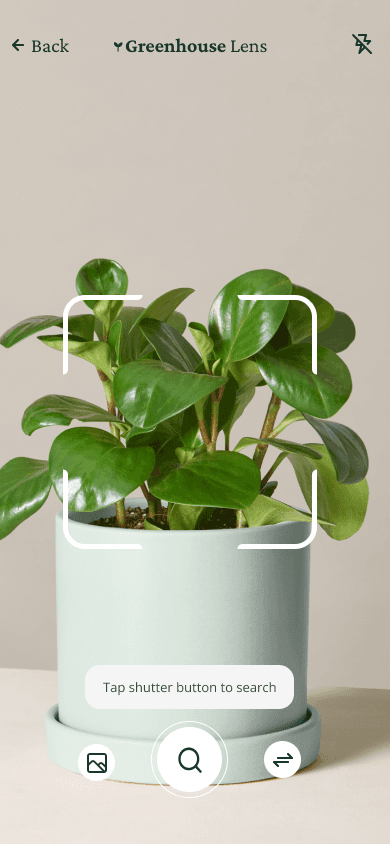
I created a user flow for Greenhouse based around the app's three main features: 1) the ability for users to view & check-off their daily tasks related to houseplant care, 2) the ability for users to search for & identify houseplants so they can easily learn basic facts about each plant along with its care needs, and 3) a virtual garden for users to be able to view their plants at a glance & monitor the water & sunlight levels of each plant. Users can also add a plant to their virtual garden.
Step 6: Moodboard
I created a moodboard in order to gather visual inspiration for the UI design of Greenhouse. I wanted the look & feel of Greenhouse to be calm & reminiscent of both plants & nature. According to color psychology, neutrals like white & beige make people feel calm, and the fewer colors used & combined in a design, the more calming it'll feel overall. The color green makes people feel refreshed, optimistic, and relaxed while pink makes people feel playful. As a result, my color palette for Greenhouse consisted of the colors: green, pink, and beige.
Step 7: Color & Typography
I decided to use a dark green text over the beige background for high contrast & accessibility. I also chose to use typefaces that looked well in various sizes. I created a typography hierarchy in order to effectively communicate through the app by having the display & heading text be largest while the body & button text were smallest. I also used left-aligned text since this is a common setting for left-to-right languages including English.
Step 8: Prototype & User Interface Design
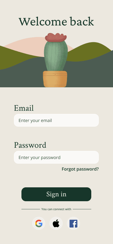
I created a high-fidelity design of the Greenhouse app and prototyped it within Figma ensuring I adhered to UI design principles & heuristics. Notably, I used some features common with other apps as well like back buttons & a navigation toolbar.
Step 9: Usability Testing
With my Figma prototype, I conducted usability tests with a representative user. I focused on the main app features & wanted to know the answers to three main questions:
Are users able to get through onboarding quickly & easily?
Are users able to efficiently learn about & care for their plants?
Are users able to complete their daily tasks?
By asking the representative user to perform tasks with the Greenhouse prototype, I was able to take note of not only where they succeeded, but where they had difficulties.
Step 10: User Interface Design Revisions
Based on the usability test results, I made a few changes to Greenhouse's UI design. The body text of the instructions during onboarding were hard for the user to read due to the font's small size so I increased it. I also re-worded some of the instructions for clarity. In the daily tasks section of the app, the user didn't know they could tap on one of their plants to see its full profile, so I added a 'Learn more' button to clarify this feature.
My Approach:
Step 1: User Research
In order to create a product that’d be helpful for houseplant owners, I first had to understand users’ existing experiences with houseplants so I created a Qualtrics questionnaire asking them directly. Eighty responses later, I discovered three key insights: 1) many users struggled with houseplant care despite trying to find care instructions themselves, 2) it was common for users to purchase houseplants for aesthetic and mental health benefits, and 3) the most important aspects of houseplant care for users were sunlight needs, watering schedule, and the plant’s overall difficulty of care. As a result of my questionnaire results, I categorized my users as either experts or novices. For experts with a large number of plants to care for, their issues concern keeping track of all their plants & knowing which need attention. Therefore, their needs consist of the ability to view daily to-do lists & tasks. For novices who love plants but don’t know how to properly care for them, their main concerns would be with finding the best plants to purchase for them. Therefore, their needs consist of the ability to get guidance & basic instructions on how to care for their plants.
Step 2: Safety
For the self-watering plant system I needed to design, there were safety considerations I needed to ensure I took into account in the early stages of my design process. The pot was designed to be a self-watering system consisting of: 1) a terracotta pot, and 2) an outer cylinder. Due to the terracotta’s porous material, plants in the pot can absorb water through the clay, essentially watering themselves. Therefore, placing this terracotta pot in an outer cylinder filled with water eliminates the need for users to always know how often and how much water their plants need since their houseplant will be able to water itself for long periods of time. The outer cylinder of the pot was designed with handles for users to hold in a power grip—their fingers firmly wrapping around the object & overlapped by their thumb—so that users’ would be able to carry the planter with their wrist in a neutral position as to prevent musculoskeletal injury or strain. Because handles that are too large or too small for users can cause fatigue due to under or over-gripping, I was able to find anthropometric data on the hand length & width of my target user group in order to design the dimensions of the handle. As for biomechanical concerns, its recommended users not try to carry anything that is one-third of their body weight due to risk of injury, and based on my research I was able to conclude that the weight of the fully constructed planter system need not exceed 40 lbs.
Step 3: Product Design
Using TinkerCAD, I designed a 3D model of the self-watering plant pot system.
Step 4: Wireframing
Based on the insights from the questionnaire, I sketched initial wireframe designs for main pages off the app.
Step 5: User Flow
I created a user flow for Greenhouse based around the app’s three main features: 1) the ability for users to view & check-off their daily tasks related to houseplant care, 2) the ability for users to search for & identify houseplants so they can easily learn basic facts about each plant along with its care needs, and 3) a virtual garden for users to be able to view their plants at a glance & monitor the water & sunlight levels of each plant. Users can also add a plant to their virtual garden.
Step 6: Moodboard
I created a moodboard in order to gather visual inspiration for the UI design of Greenhouse. I wanted the look & feel of Greenhouse to be calm & reminiscent of both plants & nature. According to color psychology, neutrals like white & beige make people feel calm, and the fewer colors used & combined in a design, the more calming it’ll feel overall. The color green makes people feel refreshed, optimistic, and relaxed while pink makes people feel playful. As a result, my color palette for Greenhouse consisted of the colors: green, pink, and beige.
Step 7: Color & Typography
I decided to use a dark green text over the beige background for high contrast & accessibility. I also chose to use typefaces that looked well in various sizes. I created a typography hierarchy in order to effectively communicate through the app by having the display & heading text be largest while the body & button text were smallest. I also used left-aligned text since this is a common setting for left-to-right languages including English.
Step 8: Prototype & User Interface Design
I created a high-fidelity design of the Greenhouse app and prototyped it within Figma ensuring I adhered to UI design principles & heuristics. Notably, I used some features common with other apps as well like back buttons & a navigation toolbar.
Step 9: Usability Testing
With my Figma prototype, I conducted usability tests with a representative user. I focused on the main app features & wanted to know the answers to three main questions:
Are users able to get through onboarding quickly & easily?
Are users able to efficiently learn about & care for their plants?
Are users able to complete their daily tasks?
By asking the representative user to perform tasks with the Greenhouse prototype, I was able to take note of not only where they succeeded, but where they had difficulties.
Step 10: User Interface Design Revisions
Based on the usability test results, I made a few changes to Greenhouse’s UI design. The body text of the instructions during onboarding were hard for the user to read due to the font’s small size so I increased it. I also re-worded some of the instructions for clarity. In the daily tasks section of the app, the user didn’t know they could tap on one of their plants to see its full profile, so I added a ‘Learn more’ button to clarify this feature.
My Approach:
Step 1: User Research
In order to create a product that’d be helpful for houseplant owners, I first had to understand users’ existing experiences with houseplants so I created a Qualtrics questionnaire asking them directly. Eighty responses later, I discovered three key insights: 1) many users struggled with houseplant care despite trying to find care instructions themselves, 2) it was common for users to purchase houseplants for aesthetic and mental health benefits, and 3) the most important aspects of houseplant care for users were sunlight needs, watering schedule, and the plant’s overall difficulty of care. As a result of my questionnaire results, I categorized my users as either experts or novices. For experts with a large number of plants to care for, their issues concern keeping track of all their plants & knowing which need attention. Therefore, their needs consist of the ability to view daily to-do lists & tasks. For novices who love plants but don’t know how to properly care for them, their main concerns would be with finding the best plants to purchase for them. Therefore, their needs consist of the ability to get guidance & basic instructions on how to care for their plants.
Step 2: Safety
For the self-watering plant system I needed to design, there were safety considerations I needed to ensure I took into account in the early stages of my design process. The pot was designed to be a self-watering system consisting of: 1) a terracotta pot, and 2) an outer cylinder. Due to the terracotta’s porous material, plants in the pot can absorb water through the clay, essentially watering themselves. Therefore, placing this terracotta pot in an outer cylinder filled with water eliminates the need for users to always know how often and how much water their plants need since their houseplant will be able to water itself for long periods of time. The outer cylinder of the pot was designed with handles for users to hold in a power grip—their fingers firmly wrapping around the object & overlapped by their thumb—so that users’ would be able to carry the planter with their wrist in a neutral position as to prevent musculoskeletal injury or strain. Because handles that are too large or too small for users can cause fatigue due to under or over-gripping, I was able to find anthropometric data on the hand length & width of my target user group in order to design the dimensions of the handle. As for biomechanical concerns, its recommended users not try to carry anything that is one-third of their body weight due to risk of injury, and based on my research I was able to conclude that the weight of the fully constructed planter system need not exceed 40 lbs.
Step 3: Product Design
Using TinkerCAD, I designed a 3D model of the self-watering plant pot system.
Step 4: Wireframing
Based on the insights from the questionnaire, I sketched initial wireframe designs for main pages off the app.
Step 5: User Flow
I created a user flow for Greenhouse based around the app’s three main features: 1) the ability for users to view & check-off their daily tasks related to houseplant care, 2) the ability for users to search for & identify houseplants so they can easily learn basic facts about each plant along with its care needs, and 3) a virtual garden for users to be able to view their plants at a glance & monitor the water & sunlight levels of each plant. Users can also add a plant to their virtual garden.
Step 6: Moodboard
I created a moodboard in order to gather visual inspiration for the UI design of Greenhouse. I wanted the look & feel of Greenhouse to be calm & reminiscent of both plants & nature. According to color psychology, neutrals like white & beige make people feel calm, and the fewer colors used & combined in a design, the more calming it’ll feel overall. The color green makes people feel refreshed, optimistic, and relaxed while pink makes people feel playful. As a result, my color palette for Greenhouse consisted of the colors: green, pink, and beige.
Step 7: Color & Typography
I decided to use a dark green text over the beige background for high contrast & accessibility. I also chose to use typefaces that looked well in various sizes. I created a typography hierarchy in order to effectively communicate through the app by having the display & heading text be largest while the body & button text were smallest. I also used left-aligned text since this is a common setting for left-to-right languages including English.
Step 8: Prototype & User Interface Design
I created a high-fidelity design of the Greenhouse app and prototyped it within Figma ensuring I adhered to UI design principles & heuristics. Notably, I used some features common with other apps as well like back buttons & a navigation toolbar.
Step 9: Usability Testing
With my Figma prototype, I conducted usability tests with a representative user. I focused on the main app features & wanted to know the answers to three main questions:
Are users able to get through onboarding quickly & easily?
Are users able to efficiently learn about & care for their plants?
Are users able to complete their daily tasks?
By asking the representative user to perform tasks with the Greenhouse prototype, I was able to take note of not only where they succeeded, but where they had difficulties.
Step 10: User Interface Design Revisions
Based on the usability test results, I made a few changes to Greenhouse’s UI design. The body text of the instructions during onboarding were hard for the user to read due to the font’s small size so I increased it. I also re-worded some of the instructions for clarity. In the daily tasks section of the app, the user didn’t know they could tap on one of their plants to see its full profile, so I added a ‘Learn more’ button to clarify this feature.





⋆.𐙚 ̊.
layla landrum